Wednesday 31 December 2014

Venice Watercolours

While in Venice I attempted to keep a travel journal. But because of time constraints I had to satisfy myself with taking a lot of photos as well. Painting takes me ages, you don't want to be stuck with me in a museum! These two paintings I made for my mom for Christmas based off of the pictures.

©chloe cornell 2014

The real reason that watercolour is so difficult is it is largely freehand, no perspective lines or sketches beforehand, and it is so fluid that it tends to go everywhere if you're not careful. I used John Singer Sargent's watercolours from Venice as inspiration for my colour palette and framing. 


All these watercolours are by John Singer Sargent and can be found on my pinterest board with links to their source, http://www.pinterest.com/atmyworktable/artists-that-inspire/

2014: Venice

For my birthday this year I took a trip to Venice with my mother and aunt. Before going I watched A Room with a View (in Florence not Venice) and Katherine Hepburn visiting Venice in Summertime. The one song I kept playing throughout my trip was O Mio Babbino Caro that plays in the opening of A Room with a View.
https://soundcloud.com/sony-classical/puccini-o-mio-babbino-caro

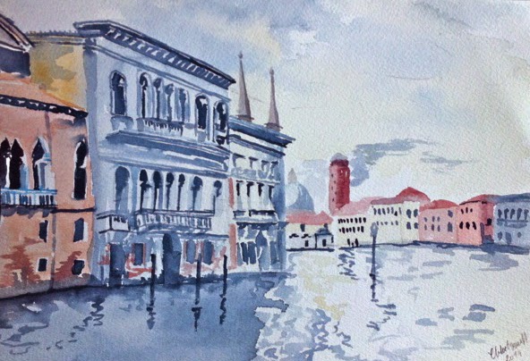
I also looked at art and design in Renaissance Italy, it's golden age where most of the old palazzos were built. But none of this research came close to describing the real thing. Despite the crowds of people the city remains timeless.


Things I will always remember about Venice:

-The sun washed look of the faded buildings
-The songbirds that live in cages on the sides of buildings
-The prevailing smell of honeysuckle and jasmine that are in all the gardens, including the airbnb place, Casa della Sposa where we stayed. 
-The whistling shorthand that the gondoliers used.
-The cleanliness of the streets, due to street sweepers in the morning and barges, which I found out while painting one morning.
-The very serious doorbells, very decorative and with inscribed plates. 
-Having to pay for the live band in the main square at the cafe, so I asked them to play Tea for Two
-The strange juxtaposition of resting gondolier and ipad.
-The serious colour coordination between painted house, curtains and flower boxes in Burano the lace-making island.
-The unexpected burst of bright green of a high up garden over faded walls
-The detail everywhere from grills in the walls to street signs
-The pink glass in the street lanterns on the main streets.
- The little dark side streets I always wanted to go off and explore, it was never ending.. reminded me of the old computer game Mist for some reason..
But the most abiding memory was the faded quality Venice had. The peeling paint and exposed brick, like the city was sleeping or under a spell. 

Casa della Sposa: https://www.airbnb.co.uk/rooms/747693 (a lovely place to stay!)

all photos by Chloe Cornell

Tuesday 2 December 2014

Rad Art

I stumbled across this tumblr account via buzzfeed, a great page featuring classical paintings with modern hip hop. I love this juxtaposition and how these words bring a new element to old paintings at flyartproductions. They really give the subjects a voice and add some humour and fun to the great masters. My tumblr, beforesunrisebeforethebirds has irregular posts,but I do love following others like these great girls at flyart.


They also recently started creating tshirts with these images. I love "Get Lucky" combined with an Edward Hopper painting, 'Summer Evening'... any ideas for Christmas presents anyone?


Shirts and more can be found at http://www.rad.co/us/brands/fly-art.html

This inspired me on my twitter feed @seewavesbreak, combining modern artists with my favourite quotes. It's always good to spread the word on artists you love!


Monday 17 November 2014

Atonement Swimsuit


The designer Jacqueline Durran on designing the swimsuit for Keira Knightly in Atonement: It was even tougher to design

" a period-appropriate (read: modest) swimsuit that wouldn't appear ''stuffy and old-fashioned to the modern eye,'' says Durran. She found inspiration in French photographer Jacques-Henri Lartigue's ''decadent, rich, and lush'' shots of 1920s and '30s south-of-France bathing beauties. But unlike the stodgy wool swimsuits from the era, Knightley's was made of a far more practical stretchy synthetic. And the white rubber cap? ''You'd have to be as beautiful as Keira to look that great in it. Lots of people can pull off swimsuits, but pulling off that hat is amazing.''.."
 from the Costumer's Guide to Movie Costumes


There are no notes on the internet besides the above quote about the swimsuit itself or how it was made. The actual pattern and subsequent suit had to be draped and drafted based on the above photos. Several things became clear looking at the source materials, the back is one piece with no centre seam. The front consists of two identical pieces to form the bodice with a front bottom piece, the seams at the front form the holes. Below are my notes on the pattern pieces.

                                         A) Hat                      B)Bathing-Cap

A) "A great white straw hat is trimmed with leafy sprays of foliage that end in yellow flowers under the brim"

B) " It's an amusing idea- this of having a tight little black bathing-cap embroidered with fishes and then covered with a net of green silk cord, so that the fish have every appearance of being caught in a decorative net.."
-Erte's Fashion Designs  218 Illustrations from "Harper's Bazar" 1918-1932: Dover Publications (1981)

I adore Erte's whimsical designs. He was also a costume designer but designed haute couture illustrations for Harper's Bazar. The above images where also inspirations for future accessories. 

Below photos of the finished swimsuit. 
Modelled by Chloe Cornell 
Photography: John Cornell 
Location: Deer Isle, Stonington, MI
August 2014


Jacques-Henri Lartigue- ,Bibi avec une ombrelle sur la plage à Cannes, 1927
I was really inspired by Jacques-Henri Lartigue's beautiful images from Cannes in the 20s. An inspiration for the Atonement film as mentioned above. Here are some more of his images,

Jacques-Henri Lartigue photos at Photography Board 

Thursday 13 November 2014

Inside My Sketchbook- "The Tempest"

So I thought I'd give you all a little peak at my sketchbook and my design process. I just finished a design for Shakespeare's "The Tempest" for my portfolio, and since the design will not make it to the stage I thought I'd share it here. My brief was to design the show to be touring, so the set had to be flexible enough to fit into many different spaces. And was able to fit into a truck for travel. The Tempest's setting is non-descript, Shakespeare merely says ' the scene, an un-inhabited island'. 
Prospero has claimed the land and he had added his own changes to the island, in the process he has gained two servants, Ariel the sprite, and Caliban the savage. Along with his daughter, Miranda, Prospero gets his change at revenge for his undeserved banishment when the King of Naples and Prospero's brother come near the island on a boat. A magical storm ensues at Prospero's command. To learn more about the play go to wikipedia.

I once saw a play back in 2006 in high school. It was Sartre's "No Exit" and one of the first plays I saw that really interested me in terms of set design. So much so that it inspired me to create a similar see-saw effect for the beginning of the Tempest, the shipwreck scene. An excerpt on the play "No Exit" from the Hartford Current with the director of "No Exit", Jerry Mouawad,


"Mouawad sets the one-act play on a 17-square-foot platform that is on a fulcrum, buttressed by bungee chords and car shock absorbers. The angle of the stage changes as the actors move around the platform, sometimes resulting in the stage's being tilted as high as 8 feet. The angle of the non-mechanized steel platform, which can move 360 degrees, is controlled by the position of the actors.
Mouawad was inspired to set the work on such a kinetic and tippy setting after working as a young man with famed French movement master Jacques Lecoq. Mouawad says Lecoq ``opened my eyes to the physical plane of the theater: architecturally, dramaturgically, emotionally.''
Mouawad remembers a Lecoq acting exercise in which a group of performers would imagine they were on a floating plane and, as they moved around, the others would react in order to keep the plane in balance."


I wanted to create a similar effect using a balance board, with a ball below the ship to create the tipping effect.


The sides of the boat were made of muslin stretched over frames, much like a canvas to allow light through. They were also slotted into the base of the boat to allow them to be removed so the actors could get on and off. The whole thing was on lockable trucks to allow for the set to be wheeled off and on. Below is my technical drawing and model. 

the initial sketches


       Technical Drawing done by Chloe Cornell 2014 #lfs


Wobble Boat model 1:25 Chloe Cornell 2014


Wobble Boat in motion CMC14

A rather intricate design for a very short scene. But worth it to have a problematic design idea to chew on for a while. A lot of fun to design and it would be great to see it realised. Never knew that a high school field trip would come in handy! 

Tuesday 11 November 2014

Tuesday Toolbox: Leather Cut-Offs


Scissors: "Ack, I need to be resharpened."

Needle: " You think you had it bad! I'm not even a leather needle, just look at the state of me! She used pliers! Pliers!"


Sunday 9 November 2014

DIY Document Portfolio

I've been loving luxury luggage for a while. It reminds me of the Golden Age of Travel from the 20s-60s and the glamour that that entails. From 'making the crossing' via an ocean liner from New York to Southampton to travelling on the Blue Train to the south of France, I love the sense of adventure and the comfort that prevailed. Unlike today with the hustle and stress that is modern air travel, that is unless you travel first class. And while I know that luxury in either time is the province of the rich I do appreciate the care and time it takes to make these expensive accoutrement. Goyard has always been a favourite of mine over LV, as it is less known and with its bright colours, more appealing to my artist's eye. While I will probably never be able to justify spending upward of £800 for a tote I can bring a bit of glam to my luggage with the help of a paint brush. I got the idea for a portfolio from Design Sponge where they were DIYing leather folders. I and since I happened to have some leather offcuts and some Liberty fabric I decided to make my friend a leather case for his birthday. Below are some inspiration photos. The rest are found on my "make" board.


The leather proved to be very soft so I stiffened it with cardboard on the back and flaps, this was covered in the fabric. It was then glued in place with a seam line left around the edges to sew with the cool neon floss I found.  The holes for sewing were made with a dowel and the envelope button was made with some paper backed in card attached with a brass split fastener. The monogram was my favourite part and maybe I'll put my new CMC monogram on some of my own leather goods. 


All in all this portfolio was fast and easy to make, though I now need to buy some more fabric glue. Hopefully in the future I can fulfil my dream of making a luggage series based off of the old luxury designs, but with wheels. For more pictures of inspiration seem my interest boards, "travel" and "make", http://www.pinterest.com/atmyworktable/.

 for sources of photos go to "make" board, http://www.pinterest.com/atmyworktable/make/, and click on relevant photos for source.