Showing posts with label Chloe Cornell. Show all posts

Tuesday, 14 July 2015

Transformed into a Swan Basket

I've always liked the summery quirky baskets from Kate Spade,


So fun, and they give off a vacation vibe that I love. I was thinking of trying my hand at basket-weaving, but then I saw this on ebay:


A cute black swan! Other similar baskets have come up claiming to be ducks, but look at those wings! 

So I painted several layers of white paint, glued on some feathers and made a drawstring pouch to go inside the basket to hold my valuables... and voila! 
The duck has become a swan, it goes perfectly with all my white summer clothes,


Wednesday, 31 December 2014

Venice Watercolours

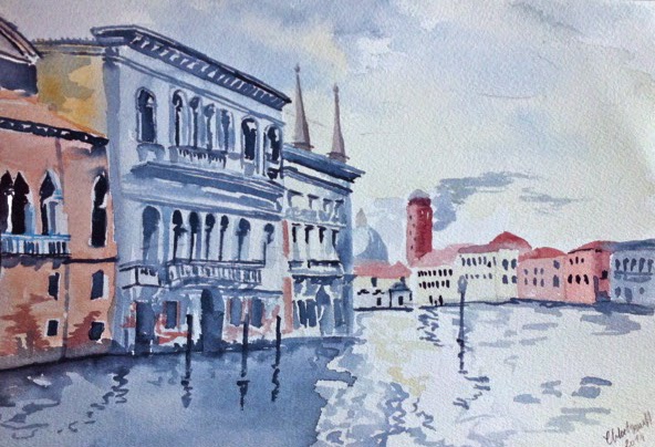
While in Venice I attempted to keep a travel journal. But because of time constraints I had to satisfy myself with taking a lot of photos as well. Painting takes me ages, you don't want to be stuck with me in a museum! These two paintings I made for my mom for Christmas based off of the pictures.

©chloe cornell 2014

The real reason that watercolour is so difficult is it is largely freehand, no perspective lines or sketches beforehand, and it is so fluid that it tends to go everywhere if you're not careful. I used John Singer Sargent's watercolours from Venice as inspiration for my colour palette and framing. 


All these watercolours are by John Singer Sargent and can be found on my pinterest board with links to their source, http://www.pinterest.com/atmyworktable/artists-that-inspire/

2014: Venice

For my birthday this year I took a trip to Venice with my mother and aunt. Before going I watched A Room with a View (in Florence not Venice) and Katherine Hepburn visiting Venice in Summertime. The one song I kept playing throughout my trip was O Mio Babbino Caro that plays in the opening of A Room with a View.
https://soundcloud.com/sony-classical/puccini-o-mio-babbino-caro

I also looked at art and design in Renaissance Italy, it's golden age where most of the old palazzos were built. But none of this research came close to describing the real thing. Despite the crowds of people the city remains timeless.


Things I will always remember about Venice:

-The sun washed look of the faded buildings
-The songbirds that live in cages on the sides of buildings
-The prevailing smell of honeysuckle and jasmine that are in all the gardens, including the airbnb place, Casa della Sposa where we stayed. 
-The whistling shorthand that the gondoliers used.
-The cleanliness of the streets, due to street sweepers in the morning and barges, which I found out while painting one morning.
-The very serious doorbells, very decorative and with inscribed plates. 
-Having to pay for the live band in the main square at the cafe, so I asked them to play Tea for Two
-The strange juxtaposition of resting gondolier and ipad.
-The serious colour coordination between painted house, curtains and flower boxes in Burano the lace-making island.
-The unexpected burst of bright green of a high up garden over faded walls
-The detail everywhere from grills in the walls to street signs
-The pink glass in the street lanterns on the main streets.
- The little dark side streets I always wanted to go off and explore, it was never ending.. reminded me of the old computer game Mist for some reason..
But the most abiding memory was the faded quality Venice had. The peeling paint and exposed brick, like the city was sleeping or under a spell. 

Casa della Sposa: https://www.airbnb.co.uk/rooms/747693 (a lovely place to stay!)

all photos by Chloe Cornell

Tuesday, 11 November 2014

Tuesday Toolbox: Leather Cut-Offs


Scissors: "Ack, I need to be resharpened."

Needle: " You think you had it bad! I'm not even a leather needle, just look at the state of me! She used pliers! Pliers!"


Sunday, 9 November 2014

DIY Document Portfolio

I've been loving luxury luggage for a while. It reminds me of the Golden Age of Travel from the 20s-60s and the glamour that that entails. From 'making the crossing' via an ocean liner from New York to Southampton to travelling on the Blue Train to the south of France, I love the sense of adventure and the comfort that prevailed. Unlike today with the hustle and stress that is modern air travel, that is unless you travel first class. And while I know that luxury in either time is the province of the rich I do appreciate the care and time it takes to make these expensive accoutrement. Goyard has always been a favourite of mine over LV, as it is less known and with its bright colours, more appealing to my artist's eye. While I will probably never be able to justify spending upward of £800 for a tote I can bring a bit of glam to my luggage with the help of a paint brush. I got the idea for a portfolio from Design Sponge where they were DIYing leather folders. I and since I happened to have some leather offcuts and some Liberty fabric I decided to make my friend a leather case for his birthday. Below are some inspiration photos. The rest are found on my "make" board.


The leather proved to be very soft so I stiffened it with cardboard on the back and flaps, this was covered in the fabric. It was then glued in place with a seam line left around the edges to sew with the cool neon floss I found.  The holes for sewing were made with a dowel and the envelope button was made with some paper backed in card attached with a brass split fastener. The monogram was my favourite part and maybe I'll put my new CMC monogram on some of my own leather goods. 


All in all this portfolio was fast and easy to make, though I now need to buy some more fabric glue. Hopefully in the future I can fulfil my dream of making a luggage series based off of the old luxury designs, but with wheels. For more pictures of inspiration seem my interest boards, "travel" and "make", http://www.pinterest.com/atmyworktable/.

 for sources of photos go to "make" board, http://www.pinterest.com/atmyworktable/make/, and click on relevant photos for source.

Wednesday, 15 January 2014

Tuesday Toolbox: The Gingerbread Construction Site


Royal Icing Piping Bag: "Pins, Secure the Tower!!"
chocolate pipettes: "Heave, Ho"
pins: "on three men, PULL!!"
wooden spoon: "Where do these go again?" (string lights)

Wednesday, 4 December 2013

Tuesday Toolbox- all in good fun


The Compass and the Protractor toss the Level:

Level "come on guys, this isn't funny! I feel so unbalanced!!"

Tuesday, 26 November 2013

Tuesday Toolbox: Stereoscope Lesson


Compass: " Ugh! It just makes me dizzy. How does it pop out at you like that?"

Pencil: "Well, I just don't believe that perspective!"

A stereoscope was an early medium for 3D technology. Whe the two seperate left and right eye images overlap with our binocular vision they form one image that seems to have depth as the horizontal position of the image seems to shift. This was an early form of home entertainment in the 1850s to the 1920s, especially for those who went on holiday around historical sites. Later this developed into the View-Master. Now we can go for the ultra-modern, the My3D app or 3D films. We are always trying to make every image hyper-real. For more information on the stereoscope go here.

The image in the stereoscope is "Farm in the Lades (House in the Garde)" by Etienne Theodore Rousseau at the Sterling and Francine Clark Art Institute.

- have you ever held out your pencil to figure out perspective?


drawing by: Chloe Cornell

Thursday, 26 September 2013

Tuesday Toolbox


Phil: " Oh my God, Frank! What happened to you?"
Frank: "I had a makeover, too much?"

Tuesday, 23 April 2013

Tuesday in the Toolbox


Blue Paintbrush: " So, what do you think about this painting on film business?"
Red Paintbrush: " Eh, it's a change but you should see how the easel has taken it...
It's really knocked him down a peg or two, he's always thought he's such an institution..."

still from STKINT film, site-specific work at Stoke Newington International Airport 2009

for full film go to www.chloecornell.com, and select STKINT project.

Tuesday, 16 April 2013

Tuesday in the Toolbox


illustration: spool-"I can't take much more of this, I'm getting seasick!"

cape: designed/made; set and costume designer: Chloe Cornell from 
" Baby Blue" '12
Dir: Lisamaria Laxholm, actress: Sydnie Haines 
illustration by Chloe Cornell
www.chloecornell.com


Tuesday, 9 April 2013

Tuesday in the Toolbox


fight: scissors " Back you fiend, back!"
         scalpel: " En garde. Tu est un imbecile!"

T square: thoughts " Just because one of you can cut metal and the other can't doesn't mean there should be a duel..."

" Don't make me call the stapler over to break you two up!"

.. apparently the stapler is a bit of a bully but he's better at breaking them up then the hammer who would just make it worse..